Sunshine per capita estimate
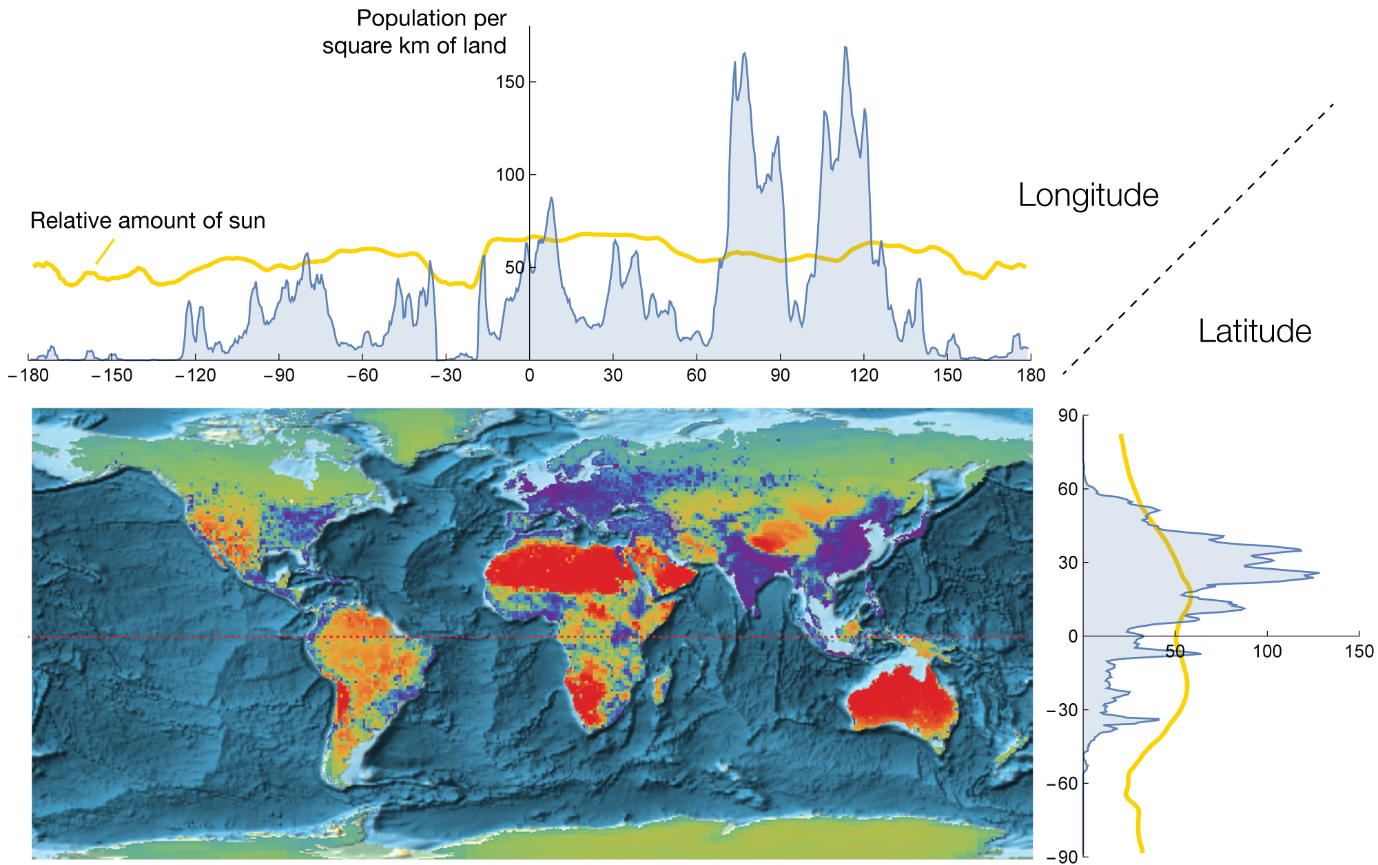
The heat map shows an effective sunshine amount per person. The red areas have plenty of sun, while purple areas have little sunshine per person.
Sun is the source of life on earth. We use it for agriculture and increasingly for electricity generation. In the long term, humanity will rely completely on the renewable energy, where the sunshine will be the most valuable natural resource. Here, I look at the regions which have the greatest amount of the sunshine per capita. Three continents stand out: Australia, Africa, and South America. They have plenty of sun for their populations. In the future, the extra sun will increase their wealth or perhaps sustain much larger populations.
Not surprisingly the great desserts are all beaming red. Today, desserts are under-utilised due to limited agriculture on them. However, in long run we will exploit these natural resources using solar cells. This is already happening.
Northern latitudes also have large untapped potential, but the Mercator projection makes it appear much larger than it actually is. In addition, the energy per land area is significantly lower and it is a seasonal resource. I will not hold my breath for it.
Calculations and data sources available on github.
on